It’s been a while since we last posted an update here, but we’re back with some exciting news. We’ve been hard at work on Pencil2D and we’d like to take a moment to showcase one of the many new features that will be included in the next version of Pencil2D: a complete redesign of our icon set!
| Old | New |
|---|---|
 |
 |
The redesign process started with Pull Request #1361 by Fatih20 back in May 2020 and then was completed mostly by our core developer MrStevns. This was a long journey that required reworking all the icons in the interface to give a more coherent feel to the application.
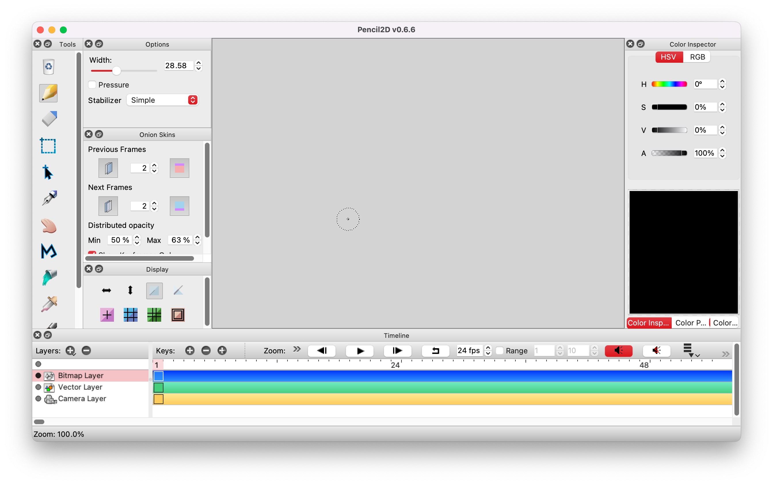
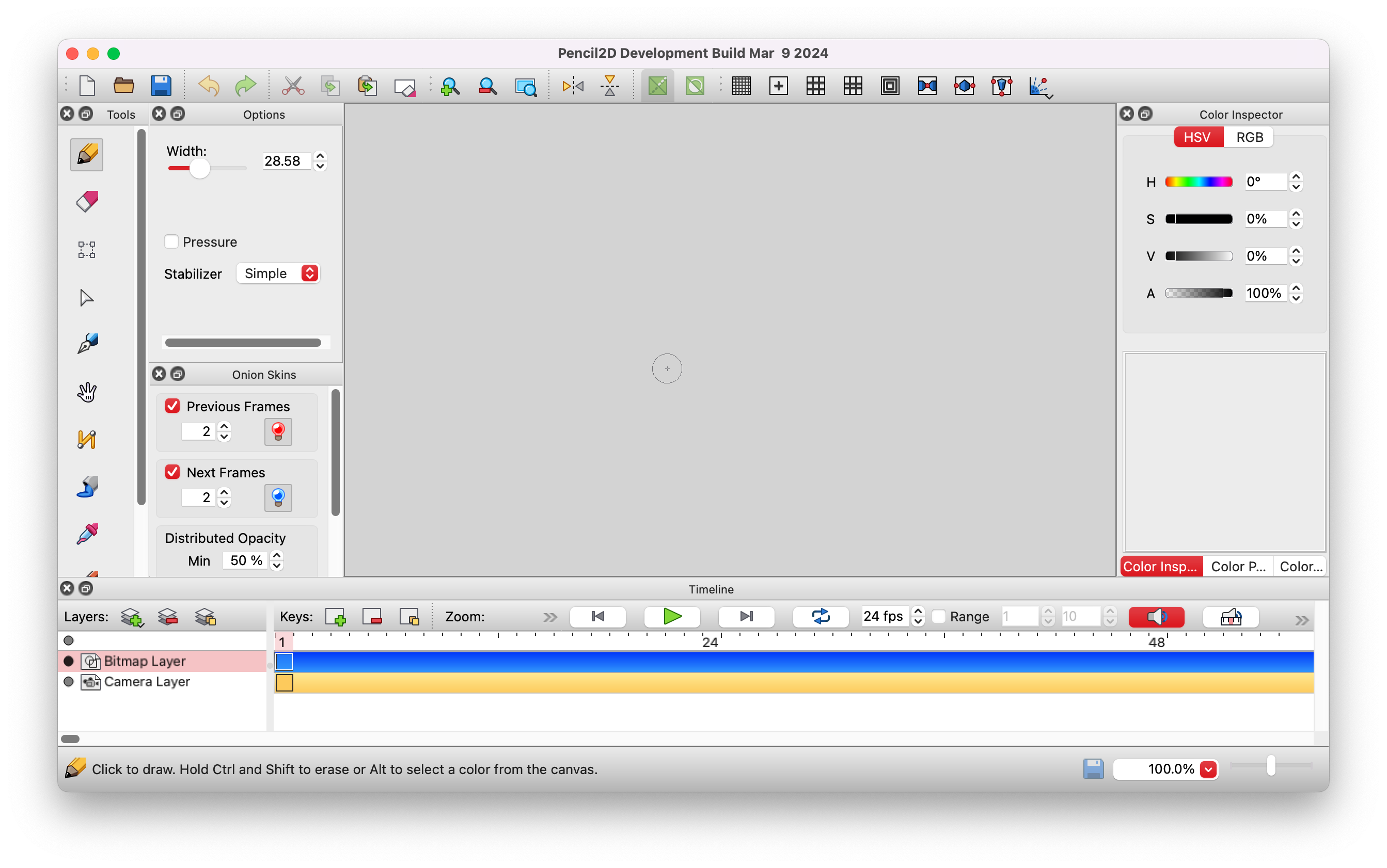
To see the new icons in action now, please download the experimental nightly builds from our website. Aside from the icons, they also come with many other exciting improvements that will be part of the next version!
In addition to the icons themselves, MrStevns has written a comprehensive overview below that explains the rationale behind the new icon design, the color palette, and how to create new icons for Pencil2D. We encourage you to check it out and get inspired to contribute to the creative process of Pencil2D.
Guiding Principles
Whereas many programs nowadays choose to go with monochrome pictograms, we still believe that color can serve a meaningful purpose and provide more identity to user interfaces without tipping over to the Windows 7 and Mac OS X eras of overly skeuomorphic icons. To that end, we decided on a cartoony art style where the colors are somewhat more vibrant, contain a limited number of shades and highlights, and are outlined. With that in mind, the following became the guiding technical and design principles for the new icon set:
- The icons should be SVG.
- The icons should be based on a 22×22 pixels canvas.
- The icons should have an outline.
- The icons should stick to the palette whenever possible. We don’t want to introduce new colors unnecessarily.
- The icons should be optimized for low-resolution display. This will ensure that the icon looks representative on any display.
- The icons should not contain gradients, soft shadows and other effects to create depth. Instead, stick to sharp shades and highlights, similar to cel shading.
- The icons’ XML hierarchies should be as flat as possible, i.e. avoid grouping elements whenever possible and don’t rely on clipping functionality.
- The icons should be compressed as much as possible.
Palette
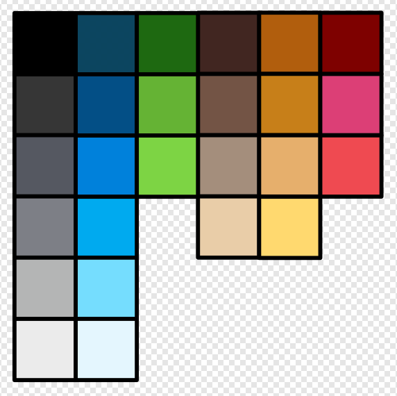
The palette currently consists of 26 colors, where blue and shades of gray have the greatest amount of variation. This palette was designed for use with Pencil2D’s default light mode interface. Therefore, not all colors in this palette will work well on a dark mode user interface (which is currently not available on most platforms). We will need to create a second palette to adapt the icons with dark mode in the future.
Color Grouping
Instead of plastering the interface with colors in all directions, which can feel nauseating to some, we figured that by utilizing the same colors for icons that share similar functionality, we can visualize how they’re grouped together.
The inspiration comes from Affinity Designer, which uses a similar approach.
Similarity Through Overlays
An aspect of the old interface that I liked and wanted to preserve was that the same icon could be re-used for similar actions, i.e. deleting a keyframe, layer, or color. Although I still wanted each icon to convey more about their specific use, I couldn’t quite put my finger on how to do it… until I stumbled upon the Icon Guidelines for Haiku OS:
Some of the system icons use overlays to further differentiate between file system objects for the user’s benefit. These objects are generally the same type and get the same base icon. A good example are the many standard folders. Since the overlays need to be reasonably clear at 16x16 icon size
Using a smaller and simpler icon as an overlay to convey meaning to the same base icon is brilliant! Now instead of creating a completely new icon for each action, which can be difficult enough without becoming too ambiguous or abstract, we can re-use the same icon.
| Old | New |
|---|---|
 |
 |
Overlays should be categorized by color and action. In the above screenshot, green means adding a keyframe, red means deleting a keyframe, and yellow means duplicating a keyframe. What the overlay conveys depends on its context.
There are times where the overlay blends in too much with the icon behind it; in those cases, applying a simple outline around the overlay can help. We ended up doing that for the color palette add and remove icons.
Technical Aspects
Besides designing the icons in the first place, we still needed to make those SVG icons look good in the context of our application, which utilizes the Qt Framework to render the graphical user interface. In this section we’ll go over optimization techniques, limitations of the Qt SVG support, and export considerations.
Optimizing for Low-Resolution Display
When working with vector graphics applications like Affinity Designer, Adobe Illustrator, or Inkscape, one can easily be deceived into thinking that making icons is a breeze compared to drawing with raster applications like Photoshop, Krita, or GIMP because of the unlimited scaling graphics aspect. Just pick whatever resolution, draw some strokes, and call it a day, right!? Well yes, if you don’t care about pixel alignment and enjoy looking at blurry icons all day!
Although we work in vector, we still have to think in pixels since that’s ultimately what we see on the screen. So in order to always get a good-looking result, the trick is to pick the lowest resolution you want to support, let’s say 22×22 (which is the lowest resolution for all our icons). We need to work within the boundaries of the canvas, and whenever possible, stay on whole pixels, i.e., x: 1, y: 2, rather than x: 0.4, y: 0.7.
Depending on whether we’re dealing with an outline or a fill, we sometimes have to work with the center of a pixel to make a line look sharp. It’s a hassle if you’ve had to go through many icons to do it, and in some cases, it can also be necessary to compromise on the look of the icon to satisfy these constraints.
Consider this example of an icon with a 1 pixel solid black border to see just what an impact pixel alignment can have at low resolutions:
| Pixel aligned | Not pixel aligned |
|---|---|
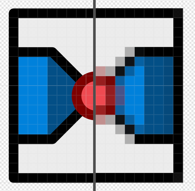 |
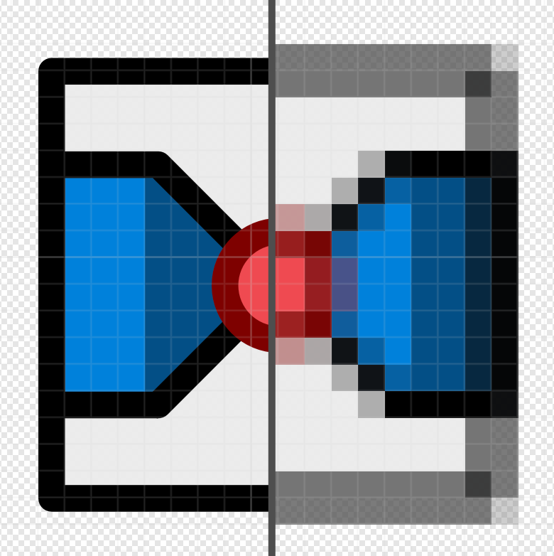 |
| Border dimensions: 17 × 17 | Border dimensions: 17.5 × 17.5 |
| Border Top-Left Position: (2.5, 2.5) | Border Top-Left Position: (2, 2) |
SVG Limitations
In my experience, using groups, clipping bounds, and effects like shadows, glow, outline, and raster images is not supported by Qt’s SVG module, so we have to avoid using these features. Instead, we need to be smart and think about how we can merge edges, pixels that overlap, and things that need to be within bounds of each other. My rule of thumb is to assume that Qt won’t render anything properly but the most basic strokes.
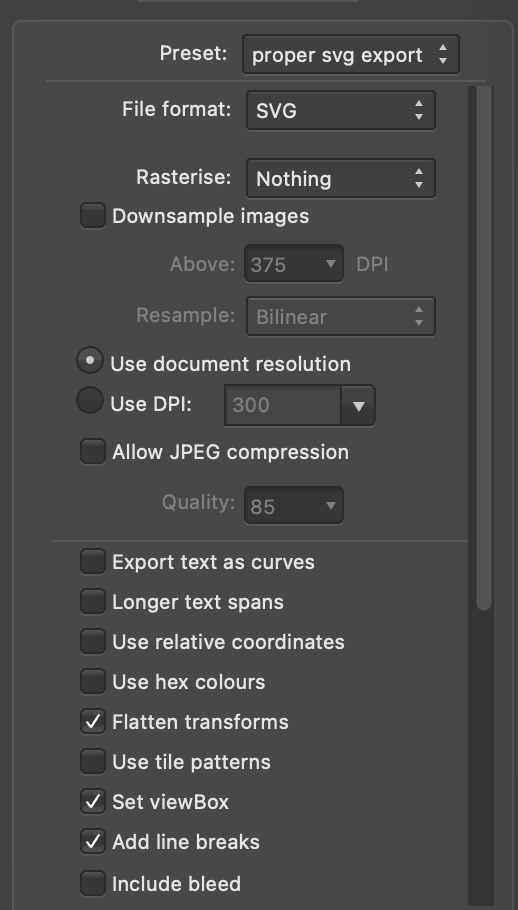
Exporting to SVG
Vector applications, like the ones mentioned earlier, have decent settings to export to SVG in a way that’s optimized for display rather than readability. We want the resulting SVG to be as simple as possible while still looking the same, so we can be sure that the computer has to do as little as possible to render our icon.
Here’s one example of how our export settings could look:
Once the icon has been exported, we have a decent baseline. In my case, this is what the resulting SVG looks like:
<?xml version="1.0" encoding="UTF-8" standalone="no"?>
<!DOCTYPE svg PUBLIC "-//W3C//DTD SVG 1.1//EN" "http://www.w3.org/Graphics/SVG/1.1/DTD/svg11.dtd">
<svg width="100%" height="100%" viewBox="0 0 22 22" version="1.1" xmlns="http://www.w3.org/2000/svg" xmlns:xlink="http://www.w3.org/1999/xlink" xml:space="preserve" xmlns:serif="http://www.serif.com/" style="fill-rule:evenodd;clip-rule:evenodd;stroke-linecap:round;stroke-linejoin:round;">
    <rect id="perspective-three-point" x="0" y="0" width="22" height="21.999" style="fill:none;"/>
    <rect id="path1466" x="2.5" y="2.5" width="17" height="17" style="fill:rgb(236,236,236);fill-opacity:0.99;"/>
    <path d="M7,6L11,8L11,14.998L9,13.998L7,6Z" style="fill:rgb(47,126,222);fill-opacity:0.99;"/>
    <path d="M15.047,6L11,7.998L11,15L13,14L15.047,6Z" style="fill:rgb(22,75,136);"/>
    <path d="M7,5.998L11,5L15.047,6L11,8L7,5.998Z" style="fill:rgb(111,175,222);fill-opacity:0.99;"/>
    <path d="M15,5.998L13,14.5L11,15.5L9,14.5L7,5.998L11,4.5L15,5.998Z" style="fill:none;stroke:black;stroke-width:1px;"/>
    <rect id="path14661" serif:id="path1466" x="2.5" y="2.5" width="17" height="17" style="fill:none;stroke:black;stroke-width:1px;stroke-linecap:butt;"/>
    <ellipse id="path861" cx="3" cy="6.999" rx="2" ry="1.999" style="fill:rgb(232,72,80);"/>
    <circle id="circle863" cx="3" cy="6.998" r="2" style="fill:none;stroke:rgb(122,0,0);stroke-width:0.99px;"/>
    <ellipse id="path8611" serif:id="path861" cx="19" cy="6.999" rx="2" ry="1.999" style="fill:rgb(232,72,80);"/>
    <ellipse id="circle8631" serif:id="circle863" cx="19" cy="6.999" rx="2" ry="1.999" style="fill:none;stroke:rgb(122,0,0);stroke-width:0.99px;"/>
    <ellipse id="path8612" serif:id="path861" cx="11" cy="18.999" rx="2" ry="1.999" style="fill:rgb(232,72,80);"/>
    <ellipse id="circle8632" serif:id="circle863" cx="11" cy="18.999" rx="2" ry="1.999" style="fill:none;stroke:rgb(122,0,0);stroke-width:0.99px;"/>
</svg>
While we could stop here and call it a day, we might as well go all the way and apply some compression, so we can, with a clean conscience, say we did our utmost to make sure that the SVG icon will be rendered with as little overhead as possible.
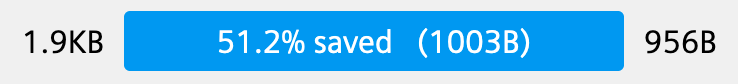
Fortunately, there are plenty of tools on the internet to help us compress our icons. My usual approach is to first use Vecta Nano and then SVGOMG, although the combination does not always result in a smaller size.
In this case, though, we shaved off an additional 119 bytes—not much, but we take what we can get.
The end result:
<svg xmlns="http://www.w3.org/2000/svg" fill-rule="evenodd" stroke-linecap="round" stroke-linejoin="round" viewBox="0 0 22 22"><path fill="#ececec" fill-opacity=".99" d="M2.5 2.5h17v17h-17z"/><path fill="#2f7ede" fill-opacity=".99" d="m7 6 4 2v7l-2-1-2-8z"/><path fill="#164b88" d="M15.05 6 11 8v7l2-1 2.05-8z"/><path fill="#6fafde" fill-opacity=".99" d="m7 6 4-1 4.05 1L11 8 7 6z"/><g fill="none" stroke="#000"><path d="m15 6-2 8.5-2 1-2-1L7 6l4-1.5L15 6z"/><path d="M2.5 2.5h17v17h-17z"/></g><circle cx="3" cy="7" r="2" fill="#e84850"/><circle cx="3" cy="7" r="2" fill="none" stroke="#7a0000" stroke-width=".99"/><circle cx="19" cy="7" r="2" fill="#e84850"/><circle cx="19" cy="7" r="2" fill="none" stroke="#7a0000" stroke-width=".99"/><circle cx="11" cy="19" r="2" fill="#e84850"/><circle cx="11" cy="19" r="2" fill="none" stroke="#7a0000" stroke-width=".99"/></svg>
Or with newlines:
<svg xmlns="http://www.w3.org/2000/svg" fill-rule="evenodd" stroke-linecap="round" stroke-linejoin="round" viewBox="0 0 22 22">
    <path fill="#ececec" fill-opacity=".99" d="M2.5 2.5h17v17h-17z"/>
    <path fill="#2f7ede" fill-opacity=".99" d="m7 6 4 2v7l-2-1-2-8z"/>
    <path fill="#164b88" d="M15.05 6 11 8v7l2-1 2.05-8z"/>
    <path fill="#6fafde" fill-opacity=".99" d="m7 6 4-1 4.05 1L11 8 7 6z"/>
    <g fill="none" stroke="#000">
        <path d="m15 6-2 8.5-2 1-2-1L7 6l4-1.5L15 6z"/>
        <path d="M2.5 2.5h17v17h-17z"/>
    </g><circle cx="3" cy="7" r="2" fill="#e84850"/>
    <circle cx="3" cy="7" r="2" fill="none" stroke="#7a0000" stroke-width=".99"/>
    <circle cx="19" cy="7" r="2" fill="#e84850"/>
    <circle cx="19" cy="7" r="2" fill="none" stroke="#7a0000" stroke-width=".99"/>
    <circle cx="11" cy="19" r="2" fill="#e84850"/>
    <circle cx="11" cy="19" r="2" fill="none" stroke="#7a0000" stroke-width=".99"/>
</svg>
With that, we should be ready to import the icon and display it with Qt.
Verifying the Result
The Qt framework officially supports the SVG 1.2 Tiny specification, which means that not all fancy features that vector applications utilize will be supported. Therefore, if an icon ends up looking off, has a blank background, or does not show at all, we need to go back to the application and simplify the SVG until it looks correct.
Want to Join the Fun?
Like this new icon set, all improvements to Pencil2D are developed by passionate volunteers in their spare time. You can also become a volunteer and contribute in various ways, not just through graphic design or programming! Please check out the Contribute page to learn more.
If you have any questions or feedback, please feel free to reach out to us on our forum or Discord.